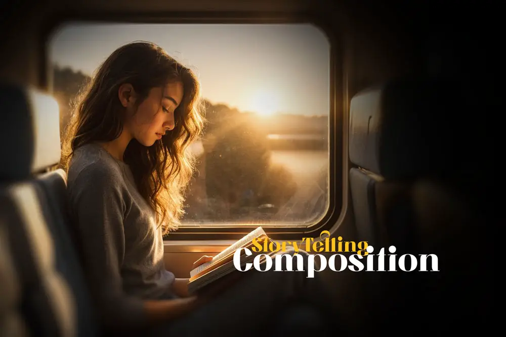
Composition in Storytelling: The Secret Language of Photography
Have you ever wondered how some photographs can capture your attention and make you feel something, while others just pass by unnoticed? How some images can tell a story, while others just show a scene? How some pictures can make you curious, while others just leave you indifferent?
The answer lies in the art of composition.
I learned the importance of composition in photography through a memory that I have in my head. A memory of a girl on the train. I saw her every day on the train ride to college, sitting on the Caltrain. She came at the same stop every day, and I always knew when she hopped on the train at Mountain View. She seemed to always appear and sit directly across from me, and I would see her through the reflection of my window, staring down at her book as the city passed us by on the train. She never spoke, and I never knew her name. But I felt a connection to her, a curiosity about her.
I imagined taking a photo of her, and I did. In my mind. In my mind, I saw the photo.
It had a complex, yet elegant composition. The book created a contrast with the window, and a harmony with her blue jeans. The reflection created a focus on her face, and a blur on the background. The angle of the camera created a perspective that made her look mysterious and intelligent. The light coming in through her hair created a silhouette that highlighted her chin, lips, and nose, forming a perfect profile. The way she stared down at her book created a mood that was thoughtful and graceful. The photo told a story. A story of a woman who had a book, who had a silhouette, who had a name.
That memory changed my life. It made me realize that composition was more than just a tool, it was an author.
Introduction: The Power of Composition in Conveying Stories
In this article, we will learn about the art of composition in photography. I will share with you the techniques and tips that I learned along the way to write a story through photos.
Table of Contents
Composition is the art of arranging the elements in your photo in a way that creates a visual narrative, meaning, mood, and emotion. It is the skill of using shapes, colors, lines, angles, and perspectives to convey your message and capture the viewer’s attention. Composition is important because it is what makes your photo stand out from the rest, and what makes it unique to your vision. Without proper composition, your photo may look dull, boring, or confusing. All these factors come together to transform a random snapshot into a story.
Elements of Composition That Enhance Storytelling
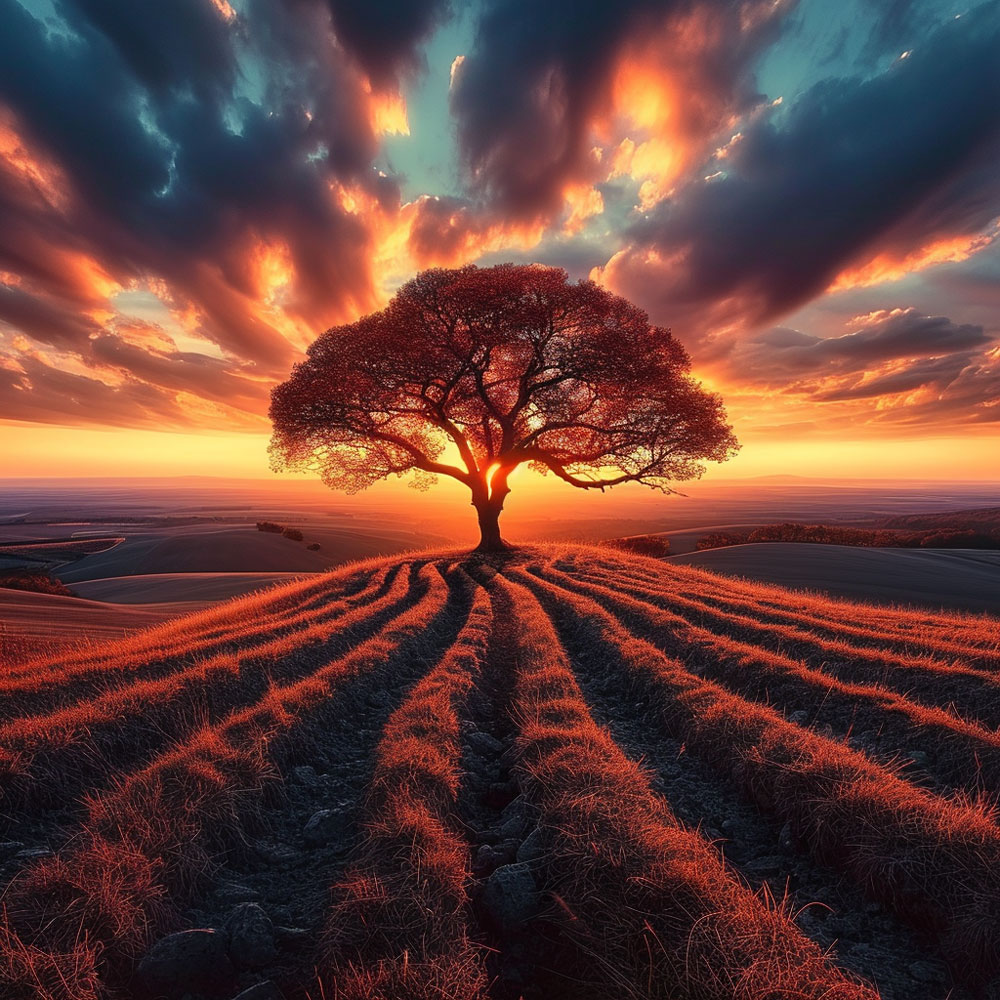
This image is a perfect example of how composition can be used to tell a story. Observe the lone tree on the hill, positioned under a dramatic sky at sunset. The tree’s isolated location and the vast sky create a feeling of loneliness and reflection.
The curving path leading to the tree acts as ‘leading lines,’ a powerful compositional element that draws the viewer’s eye into the photo, directly to the subject. The path not only guides the viewer but also implies a journey, adding depth to the story being told. This photograph demonstrates how careful composition can elicit emotions and narrate a tale without words.
Below are a list of several composition techniques to create a stunning image:
Rule of thirds:
This is a guideline that divides the frame into nine equal parts with four lines, two horizontal and two vertical. The idea is to place the main subject or points of interest along one of these lines, or near one of the four intersection points, rather than in the center of the frame. This creates a more dynamic and balanced image.
Leading lines:
These are lines that guide the viewer’s eye through the image, usually towards the main subject or focal point. They can be straight, curved, diagonal, or any shape that creates a sense of direction and depth. They can be natural, such as roads, rivers, or fences, or artificial, such as bridges, buildings, or railings.
Contrast:
This is the difference between light and dark, or between colors, shapes, or textures in the image. Contrast can create a visual impact and make the subject stand out from the background. It can also create a mood or a tone, such as dramatic, mysterious, or cheerful.
Framing:
This is the technique of using elements in the scene to create a frame around the subject, drawing attention to it and isolating it from the background. The frame can be natural, such as trees, windows, or arches, or artificial, such as doors, mirrors, or signs.
Fibonacci spiral:
This is a spiral shape that follows the Fibonacci sequence, a mathematical pattern that is found in nature, such as in shells, flowers, or pine cones. The spiral starts from a small rectangle and expands outward, creating a curve that can be used to arrange the elements in the image. The main subject or point of interest is usually placed at the end of the spiral, where the eye naturally rests.
Symmetry:
This is when the image is balanced and mirrored along a central axis, either horizontally, vertically, or diagonally. Symmetry can create a sense of harmony, order, and stability in the image. It can also create a striking and eye-catching effect, especially when combined with contrast or color.
Pattern:
This is when the image has a repeated or regular arrangement of elements, such as shapes, colors, or textures. Pattern can create a sense of rhythm, movement, and unity in the image. It can also create a contrast or a break when interrupted by a different or unique element.
Negative space:
This is the empty or unoccupied space around the main subject of the photo. Negative space can create a sense of simplicity, minimalism, or isolation in the image. It can also emphasize the subject and make it stand out more.
Rule of odds:
This is a guideline that states that an odd number of elements in a photo is more visually appealing and interesting than an even number. The reason is that an odd number creates a sense of imbalance, tension, or curiosity, while an even number creates a sense of harmony, stability, or boredom.
Fill the frame:
This is a technique of getting close to the subject and filling the frame with it, leaving little or no background. This can create a sense of intimacy, detail, or drama in the image. It can also eliminate any distracting or irrelevant elements from the scene.
Color theory:
This is the study of how colors affect the mood, emotion, and meaning of an image. Color theory can help you choose the right colors for your photo, depending on the message or feeling you want to convey. For example, warm colors such as red, orange, and yellow can create a sense of energy, excitement, or passion, while cool colors such as blue, green, and purple can create a sense of calm, relaxation, or mystery.
Golden ratio:
This is a mathematical ratio that is found in nature, art, and architecture, and is considered to be aesthetically pleasing. The golden ratio is approximately 1.618, and it can be used to create a spiral, a rectangle, or a grid. The golden ratio can help you place your main subject or points of interest in the most optimal position in the frame, creating a balance and a focus.
Center of interest:
This is the technique of placing the main subject or focal point of the photo in the center of the frame, rather than following the rule of thirds or other guidelines. This can create a sense of symmetry, stability, or importance in the image. It can also create a striking and eye-catching effect, especially when combined with contrast or color.
Rule of space:
This is the technique of leaving some space in front of the direction of movement or gaze of the main subject of the photo. This can create a sense of motion, anticipation, or interaction in the image. It can also create a balance and a direction, as the subject leads the eye to the empty space.
Juxtaposition:
This is the technique of placing two or more contrasting or opposing elements in the same frame, creating a comparison or a contrast. This can create a sense of tension, conflict, or humor in the image. It can also create a message or a meaning, as the elements relate to each other.
Point of view:
This is the technique of changing the position or angle of the camera to create a different perspective or impression of the subject. The point of view can be high, low, close, far, tilted, or straight, depending on the effect you want to achieve. The point of view can create a sense of scale, drama, intimacy, or curiosity in the image.
The image presented is a striking example of how framing can be utilized to focus attention and enhance a brand in fitness photography. The image presented is a striking example of how framing can be utilized to focus attention and enhance a brand in fitness photography.

Notice how the subject is framed within the boundaries of a shower, with water droplets cascading down the transparent barrier, creating a sense of intensity and raw power. The water droplets on the glass add a textural layer that contrasts with the clarity and determination in the subject’s eyes.
This effect emphasizes the subject’s physique, showcasing the fruits of dedication to fitness. The use of a tight frame within the shower enclosure symbolizes a personal space of transformation and discipline that is required in fitness.
This careful composition not only highlights the physical attributes of the subject but also conveys the grit and passion behind personal fitness journeys, effectively marrying the visual impact with the brand’s narrative.
Each element in this photo – from framing and lighting to texture – works together to tell a story that connects with viewers, showcasing the powerful impact of composition in storytelling photography.
Framing: A Summer Serenade in Yellow
This image employs a framing composition that accentuates the Seafolly swimwear brand, utilizing the natural elements and color contrast to draw the viewer’s eye directly to the product. The subject is positioned against a clear blue sky, which acts as a clean, uncluttered backdrop making the vibrant yellow of the swimwear pop. The golden yellow marigolds at the bottom frame the photograph with a splash of coordinating color, creating a harmonious palette that echoes the tones of the swimwear and the headwrap.
This deliberate choice of framing uses the rule of thirds to balance the image, with the subject off-center, invoking a sense of movement and space. The high-waisted cut of the swimwear and the bandeau top are highlighted by the open sky, emphasizing the design and fit of the swimwear. The subject’s upward gaze and the positioning away from the camera give a sense of aspiration and confidence, aligning with the brand’s image of youthful energy and stylish beachwear. Overall, the framing in this composition not only showcases the swimwear but also tells a story of summer, freedom, and the joy of sunny days.

Framing in photography involves using elements within the scene to create a ‘frame’ around the subject. This technique not only focuses the viewer’s attention but also adds depth and context to the image.
Perspective and Angle: Influencing n Perceptions
Perspective and Angle have a crucial role in storytelling. A bird’s-eye view can convey a sense of overview or detachment, while a worm’s-eye view might evoke a feeling of awe or intimidation. Capturing a subject from an unusual angle can create curiosity and draw the viewer into the narrative.

The chosen perspective and angle in this photograph are instrumental in defining the intensity and dynamism of the scene. Captured from a low angle, the image elevates the subject, a boxer in action, imparting a sense of power and determination. This perspective invites the viewer to feel the boxer’s strength and focus as he connects with the punching bag.
The proximity of the camera to the action creates an almost palpable tension. Each drop of sweat and the explosive movement of water are accentuated, giving the viewer a visceral sense of the boxer’s exertion and the physicality of the sport. The stark contrast of light and shadow, combined with the monochromatic color scheme, adds a dramatic effect, highlighting the boxer’s muscles and the texture of the punching bag, which is adorned with cautionary stripes that seem to warn of the intensity within.
By choosing this angle, the photographer not only showcases the athlete’s skill and physicality but also evokes an emotional response, placing the viewer in the midst of the narrative, almost feeling the impact of each punch. This technique effectively draws the viewer into the boxer’s world, feeling the gravity of his training and the seriousness of his craft.
Light and Shadow: The Play of n Illumination and Obscurity
Light and Shadow are powerful tools in a photographer’s arsenal. They can create mood, highlight key elements, or introduce mystery. A photograph with stark contrasts between light and dark areas can dramatize the scene, adding layers of meaning to the narrative.
In the above, the interplay of light and shadow is used to enhance the storytelling, carving out the scene with dramatic contrasts. The focused beam of light illuminates the boxer and the striking surface of the punching bag, creating a spotlight effect that emphasizes the action and intensity of the moment. Shadows are cast boldly, deepening around the edges and under the boxer’s form, which accentuates the contours of his physique and the exertion of his punch.
One of the most popular and effective rules of composition in visual storytelling is the rule of thirds. It’s a simple yet powerful technique that can help you create balanced, dynamic, and interesting compositions. It’s a technique that can make your stories more engaging and appealing to the viewer. The rule of thirds involves dividing the frame into a grid of nine equal segments, using two horizontal and two vertical lines. The idea is to place the most important elements of your story along these lines or their intersections, also known as the points of interest. This way, you can create a sense of harmony, movement, and tension in your composition, depending on how you use the rule.
Field of Solace
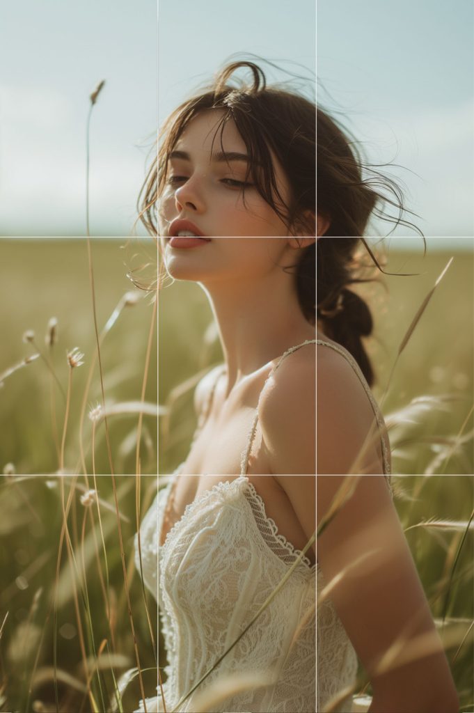
In this softly lit portrait, the rule of thirds is utilized to create a composition that feels both grounded and ethereal. The subject, a young woman dressed in white, is placed along the left vertical third, allowing the vast expanse of the field to breathe and fill the rest of the frame.
Her gaze is thoughtfully directed just off-camera, aligning with the intersection of the rule’s upper and left thirds, which draws the viewer into a moment of contemplation alongside her.
The horizon gently kisses the bottom third of the image, grounding the subject in the whispering grass that seems to cradle her in nature’s embrace. This compositional choice not only anchors her in the environment but also gives a narrative weight to the space above her—a canvas of possibilities and dreams yet to unfold.
The image tells a story of serenity and introspection. The woman, amidst the windswept field, becomes a muse of the natural world, her presence a gentle reminder of the beauty found in quiet moments. The rule of thirds here does more than just guide composition—it helps weave a visual tale of harmony between humanity and the earth, an elegy to the silent stories that unfold in the world’s unspoken spaces.
The Rule of Thirds encourages photographers to avoid placing the subject directly in the center of the frame, which can sometimes result in a static and less interesting composition. By aligning the subject with the guide lines and their intersections, the photograph becomes more balanced and allows for a more natural viewing experience that aligns with how our eyes naturally interact with images. This is the most popular composition used by everyone.
Color and Contrast: The Language of Emotions

In this image, the vivid colors and high contrast play a significant role in storytelling.
The use of vibrant colors evokes specific emotions and guides the viewer’s interpretation of the scene. Contrast, particularly in color, adds depth and dimension, making the image more striking and memorable.
The subject’s eyes are the centerpiece, drawing the viewer in with an almost magnetic pull. They are highlighted by an array of iridescent hues—gold, turquoise, and hints of purple—that contrast with the deep, earthy tones of her skin. The flecks of color on her skin mimic the scatter of stars in a night sky, suggesting a cosmos of thoughts and dreams behind her gaze.
The intense pigmentation around the eyes creates a sense of drama and emphasizes the subject’s expression, which is one of contemplation and depth. The contrast between the bright, shimmering eye makeup and the natural skin tone narrates a story of duality—between the vibrant persona we project to the world and the rich, complex nature of our inner selves.
Texture and Detail: Telling Stories Through Tactile Qualities
Texture and detail play significant roles in this visual tale. The fine details of the subject’s freckles, the delicate texture of her skin, and the soft fibers of the yellow fabric she holds near her face add layers of tactile quality to the image. They tell a story through touch, from the rough glitter on her eyelids to the cozy knit of her garment, inviting the viewer to imagine the sensory experience of the scene.
Each element—the color, contrast, texture, and detail—works in concert to weave a narrative that speaks to both the seen and unseen beauty, the tactile and the ephemeral, in a portrait that celebrates the art of makeup and the canvas of human skin.
In the world of contemporary photography, composition is the secret script that tells a story. In this section, we will take a look at various photographs, zooming in on how masterful composition serves as the backbone of visual storytelling. Each case study will break down specific compositional techniques and their impact on the narrative conveyed.
Framing and Perspective:
How the boundaries of the photograph and the angle of view can sharpen the story and steer the viewer’s eye.
Light and Shadow:
The dramatic interplay between light and dark areas, and its role in creating the mood and spotlighting subjects.
The Rule of Thirds:
A fundamental composition principle that aligns subjects and elements in a way that is aesthetically pleasing and engaging.
Color and Contrast:
The use of colors and contrast to trigger emotions and draw attention to key aspects of the narrative.
Texture and Detail:
The intricate details that breathe life into a story, offering depth and context to the composition.
As we examine these elements, we consider how the deliberate choices made by photographers in framing, perspective, lighting, and other compositional aspects contribute to powerful storytelling in photography. These are the threads that weave together to create a captivating visual narrative, each technique offering a different shade of meaning to the image’s story.

A Rainbow of Heritage
The portrait of a woman is a kaleidoscope of colors, revealing the story of identity and cultural expression. Here, composition harnesses the rule of thirds and color contrast to make her features pop against a blank background, emphasizing the story of diversity and heritage painted across her face.
The colors are not random, but carefully chosen to represent different aspects of her personality and background.
The red symbolizes passion and energy, the yellow signifies joy and optimism, the green denotes harmony and growth, and the blue expresses calmness and trust. The composition creates a visual symphony that celebrates the woman’s uniqueness and beauty.
Rainy Day of Perseverance
Framing and perspective are key in the photograph of a man in the rain, telling a story of perseverance and determination. The texture of the rain and the contrasting lights create a setting that mirrors the narrative of overcoming challenges. The framing creates a sense of isolation and focus, while the perspective creates a sense of depth and scale.
The rain and the lights create a contrast that emphasizes the struggle and the hope of the subject, drawing the viewer’s attention to the subtle expressions that convey emotion. The composition creates a visual reflection that inspires the viewer to empathize and relate with the subject’s journey.

A Scattered Face
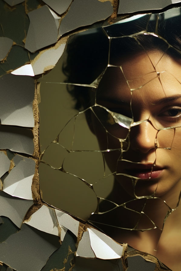
The image of a face through a shattered mirror utilizes the rule of thirds to draw the eye to the aligned eyes, with the texture of the broken glass contrasting against the soft features of the face. This composition narrates the complexity of identity and the multifaceted nature of the human psyche.
The shattered mirror creates a sense of fragmentation and distortion, while the eyes create a sense of focus and clarity. The texture and the contrast create a tension that challenges the viewer to question and interpret the image. The composition creates a visual metaphor that reveals the subject’s inner conflict and self-discovery.
By exploring these images, we understand how masterful composition in photography is not just about the aesthetic arrangement of elements within a frame but also about the deeper stories these elements can tell. From the symbolic resilience depicted in a simple tree to the human experience reflected in a portrait, composition is the language through which photographers communicate with their audience.
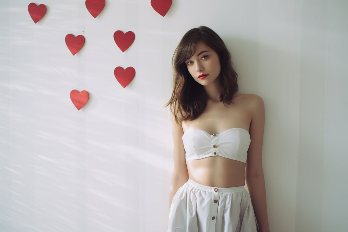
In this portrait, the composition plays a crucial role in creating a mood and conveying a narrative. Here are several compositional elements at work:
Subject Placement and Pose:
The subject is positioned slightly off-center, which creates a natural, more dynamic feel compared to being directly in the center. Her gaze towards the camera establishes a direct connection with the viewer, while her relaxed pose and slight tilt of the head add to a feeling of openness and accessibility. She looks confident and comfortable in her own skin, inviting the viewer to get to know her better.
Use of Color and Contrast:
The soft pastel tones of the subject’s outfit contrast with the warm red of the heart shapes and her lips, drawing attention to her face. The color palette is gentle and romantic, which is reinforced by the hearts, suggesting themes of love or beauty. The colors are not random, but carefully chosen to represent different aspects of her personality and background. The red symbolizes passion and energy, the yellow signifies joy and optimism, the green denotes harmony and growth, and the blue expresses calmness and trust. The composition creates a visual symphony that celebrates the woman’s uniqueness and beauty.
Background Elements:
The hearts in the background are arranged in a descending diagonal line from top left to bottom right, leading the eye across the frame and back to the subject. This subtle use of leading lines within the composition adds depth to the image and keeps the viewer’s attention on the subject. The hearts also create a sense of repetition and rhythm, adding to the visual appeal of the image.
Lighting:
The lighting is soft and diffusive, casting a gentle shadow to the right and creating a subtle sense of volume and dimensionality. The softness of the light complements the theme and the gentle expression of the subject. The lighting also creates a sense of warmth and coziness, making the image more inviting and relatable.
Negative Space:
The ample negative space to the left of the subject provides a balance to the composition, giving the subject’s gaze room to breathe and further accentuating her presence within the frame. The negative space also creates a sense of simplicity and minimalism, allowing the viewer to focus on the essential elements of the image.
Overall Mood:
The composition of this portrait—through its use of space, color, and subject placement—creates a cohesive mood that is contemplative, tender, and softly evocative. It’s a great example for portrait photographers looking to infuse their images with a sense of narrative and emotion.
To enhance the storytelling impact of your photographs through composition, consider these actionable tips:
Study the Masters:
Look at the work of renowned photographers and analyze how they compose their shots. Pay attention to how they use the frame, where they place their subjects, and how they utilize light and shadow.
Practice the Rule of Thirds:
Start by practicing the Rule of Thirds until it becomes second nature. Place points of interest in your scenes along the lines or at the intersections of this compositional grid.
Experiment with Perspectives:
Don’t just shoot from eye level. Try different angles and perspectives to find new ways to tell a story with your image.
Use Leading Lines:
Incorporate elements in your scenes that guide the viewer’s eye toward your subject, such as roads, fences, or patterns.
Play with Light:
Observe how light interacts with the environment and your subject. Use it to create mood, highlight features, or cast interesting shadows.
Embrace Negative Space:
Use negative space to draw focus to your subject and create a clean, uncluttered look that emphasizes the story you want to tell.
Seek Out Patterns and Symmetry:
Patterns and symmetry can be very pleasing to the eye. Use them to create rhythm and flow in your photographs.
Focus on the Eyes in Portraits:
When taking portraits, remember that the eyes often hold the story. Make sure they are in focus and well-lit.
Keep Learning and Experimenting:
Composition is an art that you can always improve upon. Keep learning new techniques, experimenting, and taking lots of photographs.
By following these tips and continually practicing, photographers can significantly improve the compositional aspects of their work, leading to more powerful and engaging storytelling through their images.
How to Use Lighting and Color to Create Mood and Meaning in Your Stories
What makes a story visually appealing, emotionally engaging, and narratively compelling? It’s not just the composition of the elements within a frame; it’s also the lighting and color of those elements. Lighting and color are not just decorative features; they are powerful storytelling tools that can set the mood, tone, and atmosphere of your story. They can create contrast, harmony, and symbolism in your visual narrative. They can evoke feelings, emotions, and associations in your viewer. In this part of the article, you’ll learn how the strategic use of lighting and color can transform your story.
How to Analyze and Apply Lighting and Color in Different Storytelling Formats
Lighting and color are versatile and universal elements that can be applied across different storytelling formats, such as photography, film, graphic novels, and video games. They can create different effects, such as focus, depth, emotion, and perspective, in your visual stories. I’ve written separate articles on the topics of color and provided links below. To summarize:
Color psychology in visual narratives:
Colors have the power to convey different emotions, moods, and themes in your story. By using color schemes and color contrasts, you can create visual impact and enhance your narrative. [Learn More]
Color theory in storytelling photography:
Colors have the power to create harmony and balance in your photographs. By using the color wheel, color harmony, and color temperature, you can create stunning and expressive photographs that tell a story. [Learn More]
The role of lighting in creating mood in visual narratives:
Lighting has the power to create different atmospheres and feelings in your story. By using lighting techniques, such as direction, intensity, and quality, you can create dramatic, mysterious, or romantic moods in your story. [Learn More]
The effect of lighting and color on perspective and depth in visual narratives:
Lighting and color have the power to create a sense of space, distance, and dimension in your story. By using lighting and color to create depth cues, such as size, overlap, and shading, you can create a sense of perspective and realism in your story. You can also manipulate lighting and color to create illusions and effects, such as depth of field, motion blur, and color grading. [Learn More]
Lighting and color are powerful tools of composition in visual storytelling. By using lighting and color effectively, you can create impactful and memorable stories that captivate and engage your audience. Learn more about color usage in your composition, by clicking those links above.
How to Master Composition in Storytelling Photography
If you enjoyed this article and want to learn more about how to use composition to tell powerful stories with your photos, make sure to check out my Visual Story Telling techniques page, where I go into more depth and detail about the art of visual storytelling. You’ll find more examples, tips, and tricks to help you master this skill and create captivating images that connect with your audience. That’s all for now, have a wonderful day! [Click here] to visit my Visual Story Telling techniques page.
Introduce yourself to the Basics of Visual Storytelling Have you ever felt like the world is amazing, even if you’re full of tears and sadness? Have you ever wanted to express your true self and your vision through your brand? If so, then you need to learn the art of visual storytelling. Visual storytelling is…




Leave a Reply