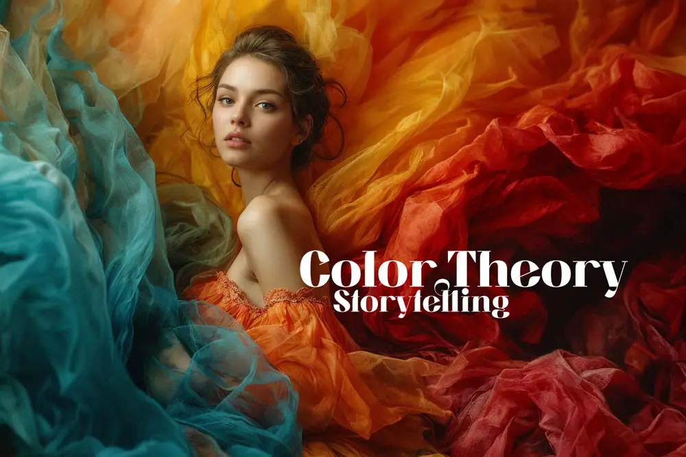
Color Theory in Storytelling Photography: A Master Class
The rain falls gently, creating a serene yet melancholic atmosphere. You notice a woman sitting alone, her figure illuminated by the soft, diffuse light. The raindrops create a symphony of muted tones, casting the world in a palette of grays, blues, and subtle greens. You feel a wave of empathy as you observe her solitude in the rain, and you reach for your camera to capture this poignant moment.
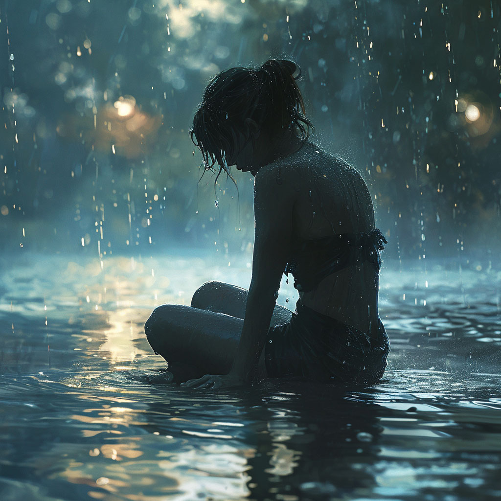
In this scene, color becomes more than just a visual component in photography; it’s an emotional language. The subdued hues of the rain-soaked environment contrast with the vibrant, warm colors often associated with joy and sunlight.
This contrast not only creates a visual appeal but also deepens the narrative of the photograph. The way the colors blend and interact under the overcast sky speaks volumes about the mood and atmosphere of the moment.
But how do you effectively control the power of color in such settings? How do you choose the right palette to convey the emotions and story you wish to tell? Understanding color theory is key to mastering this art.
Color Theory in Storytelling Photography
In this exploration of color theory in storytelling photography, you’ll go down the rabbit hole into the nuances of using color to convey emotion. You’ll learn about color schemes, and how they can evoke feelings of introspection, melancholy, or peace. You’ll understand how to use the subtlety of color to create powerful, emotive imagery that resonates with viewers.
By the end of this guide, you will have the tools to use color in a way that not only captures the eye but also touches the heart. Whether you’re a novice or a seasoned photographer, this insight will enhance your ability to tell compelling stories through your photographs in any situation.
Table of Contents

Before we go deep into the emotional impact of colors and how to use them for storytelling, we need to understand some basic concepts and principles of color theory. Color theory is the science and art of how colors work together to create different effects and meanings. It can help us choose the right colors for our photos, and use them effectively to convey our message.
In this section, we will cover the following topics:
Primary, Secondary, and Tertiary Colors
Color Wheel
Color Harmony
Color Context
Primary, Secondary, and Tertiary Colors
The first thing we need to know about color theory is the classification of colors into three categories: primary, secondary, and tertiary colors.
Primary colors:
Primary colors are the three colors that cannot be created by mixing any other colors. They are red, yellow, and blue. These are the colors that form the basis of all other colors.
Secondary colors:
Secondary colors are the three colors that are created by mixing two primary colors. They are green, orange, and purple. These are the colors that are opposite to the primary colors on the color wheel.
Tertiary colors:
Tertiary colors are the six colors that are created by mixing a primary and a secondary color. They are yellow-orange, red-orange, red-purple, blue-purple, blue-green, and yellow-green. These are the colors that are between the primary and secondary colors on the color wheel.
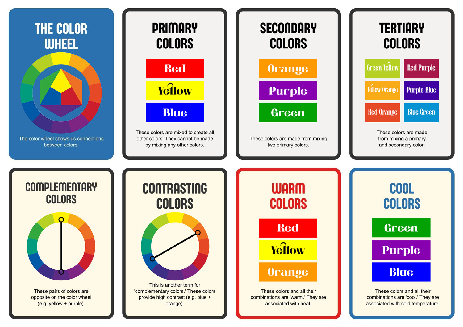
Primary, secondary, and tertiary colors are important for understanding how colors relate to each other, and how they can be used to create different color schemes.
Color Wheel
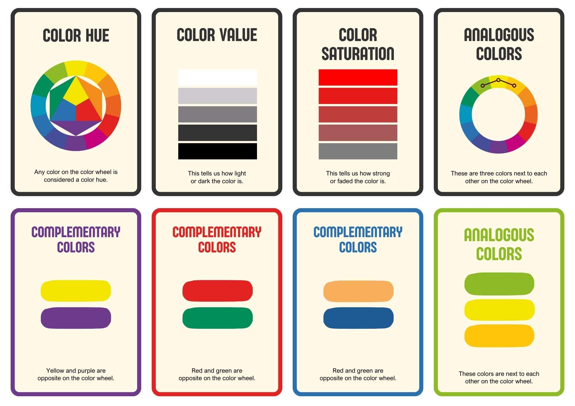
The color wheel is a circular diagram that shows the colors in relation to each other. It is based on the primary, secondary, and tertiary colors, and it can be used to create different color schemes based on hue, saturation, and value.
Hue is the name of the color, such as red, blue, or green. It is determined by the wavelength of light that is reflected by the object.
Saturation is the intensity or purity of the color, such as bright, dull, or gray. It is determined by the amount of white or black that is mixed with the hue.
Value is the lightness or darkness of the color, such as light, medium, or dark. It is determined by the amount of light that is reflected by the object.
The color wheel can be used to create different color schemes based on the position and distance of the colors on the wheel. Some common types of color schemes are:
Monochromatic:
A color scheme that uses only one hue and its variations in saturation and value. For example, a monochromatic color scheme of red could use bright red, dark red, pink, and maroon.
Analogous:
A color scheme that uses colors that are next to each other on the color wheel. For example, an analogous color scheme of red could use red, red-orange, and orange.
Complementary:
A color scheme that uses colors that are opposite to each other on the color wheel. For example, a complementary color scheme of red could use red and green.
Triadic
A color scheme that uses two pairs of complementary colors. For example, a tetradic color scheme of red could use red and green, and blue and orange.
Tetradic:
A color scheme that uses two pairs of complementary colors. For example, a tetradic color scheme of red could use red and green, and blue and orange.
The color wheel can help us choose colors that create harmony or contrast in our photos, and that suit our mood and message.
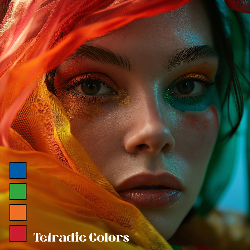
Tetradic Colors:
The image features a tetradic color scheme, where four colors, two sets of complementary pairs, are used for a rich and complex visual effect. The reds and oranges that dominate the foreground, full of warmth and intensity, are offset by the cool teal and green hues that are subtly present.
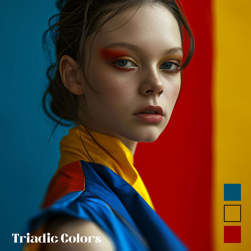
This color combination can symbolize a story of vibrancy and energy (through the warm colors) meeting tranquility and freshness (through the cool colors), conveying a sense of dynamic equilibrium. The interplay of these hues could reflect a character’s multifaceted nature or a journey that encompasses varied emotional landscapes.Triadic Colors:
The image employs a triadic color scheme, creating a bold and balanced visual story. The model’s eye makeup in vibrant red and gold stands in stark contrast to the blue tones of her attire, while the background splits between blue and red.
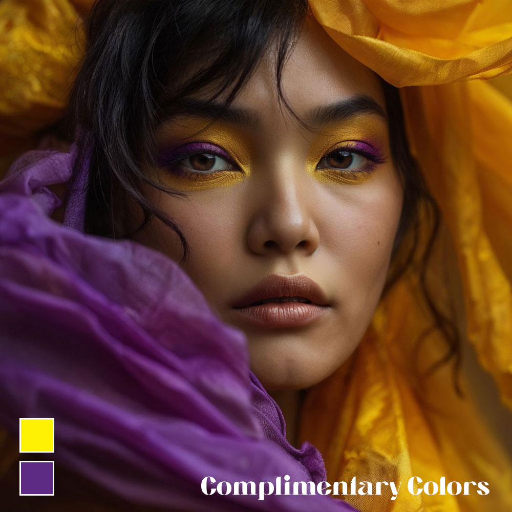
These colors, equidistant on the color wheel, bring a sense of harmony despite their difference, illustrating a narrative of diverse elements coming together to create something striking and cohesive. The story here could be one of unity in diversity, where distinct qualities combine to form a singular, compelling identity.Complimentary Colors:
In this image, the use of complementary colors creates a dynamic and visually compelling narrative. The vivid yellow of the subject’s headwear and the purple fabric wrapped around her generate a striking contrast, with yellow and purple sitting opposite each other on the color wheel.
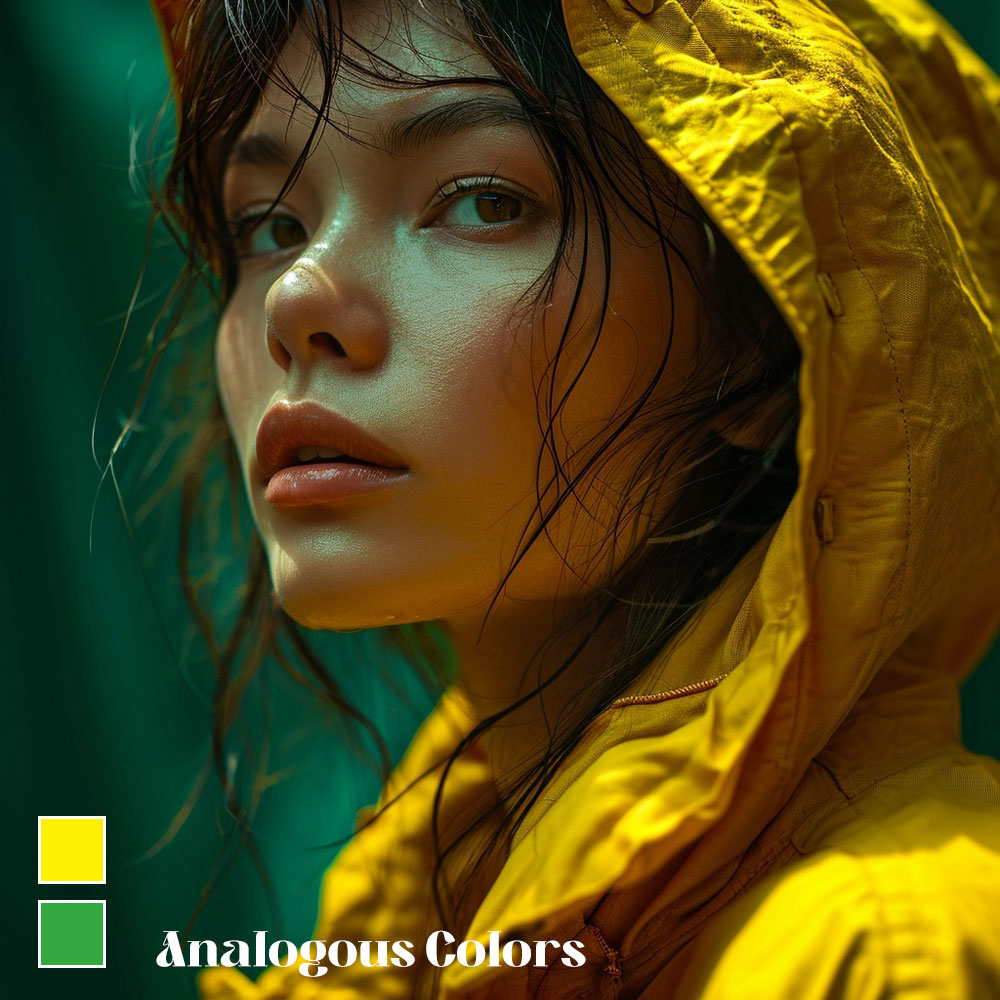
This juxtaposition symbolizes the duality within the story—perhaps reflecting opposing forces or contrasting emotions within the subject. The interplay of these colors can also suggest a balance of warmth and coolness, brightness and depth, contributing to a tale of complexity and harmony.Analogous Colors:
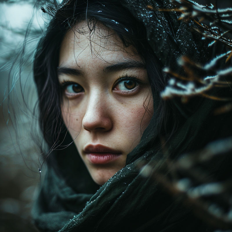
The image presents a vivid yellow hood that captures the essence of a story about hope and vibrancy in the midst of calm. The yellow, full of energy and optimism, stands out against the tranquil green background, suggesting a narrative where brightness and life emerge from a peaceful, introspective space.
The raindrops add a sense of renewal, as if the subject is at the beginning of a hopeful journey.Monochromatic Colors:
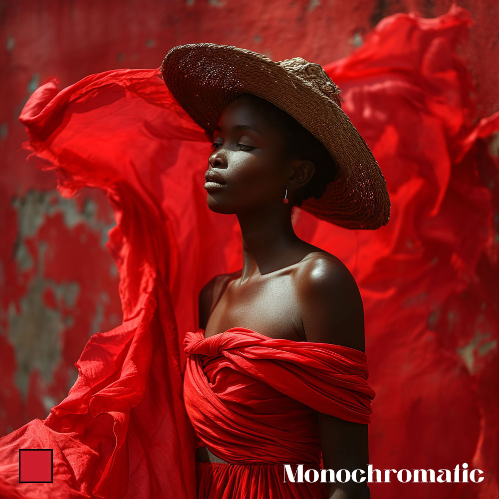
The image showcases a monochromatic color scheme, which uses varying shades and tones of a single color to create a unified and impactful visual experience. Here, the subject is enveloped in different shades of red, from the deep, rich tones of her dress to the lighter, more vibrant shades in the flowing fabric and the textured background.
This use of red could symbolize a range of emotions, from passion and strength to love and courage. The consistency of color emphasizes the subject’s poise and the dramatic flair of her attire, crafting a story that speaks to the depth and intensity of a singular emotion or experience.
Color Harmony
Color harmony is the pleasing arrangement of colors in a composition. It can be achieved by using colors that are related or compatible with each other, according to the color wheel.
Color harmony can create different effects and meanings in our photos, such as:
Balance:
A sense of order and stability that is achieved by using colors that are symmetrical or proportional on the color wheel. For example, a balanced color scheme could use complementary colors, such as red and green, or triadic colors, such as red, blue, and yellow.
Tension:
A sense of movement and excitement that is achieved by using colors that are asymmetrical or contrasting on the color wheel. For example, a tense color scheme could use analogous colors, such as red, red-orange, and orange, or tetradic colors, such as red, green, blue, and orange.
Emphasis:
A sense of focus and importance that is achieved by using colors that are dominant or accentuated on the color wheel. For example, an emphasized color scheme could use a monochromatic color scheme of red, with a splash of green as an accent.
Color harmony can help us create photos that are pleasing to the eye, and that communicate our message effectively.
Balance:
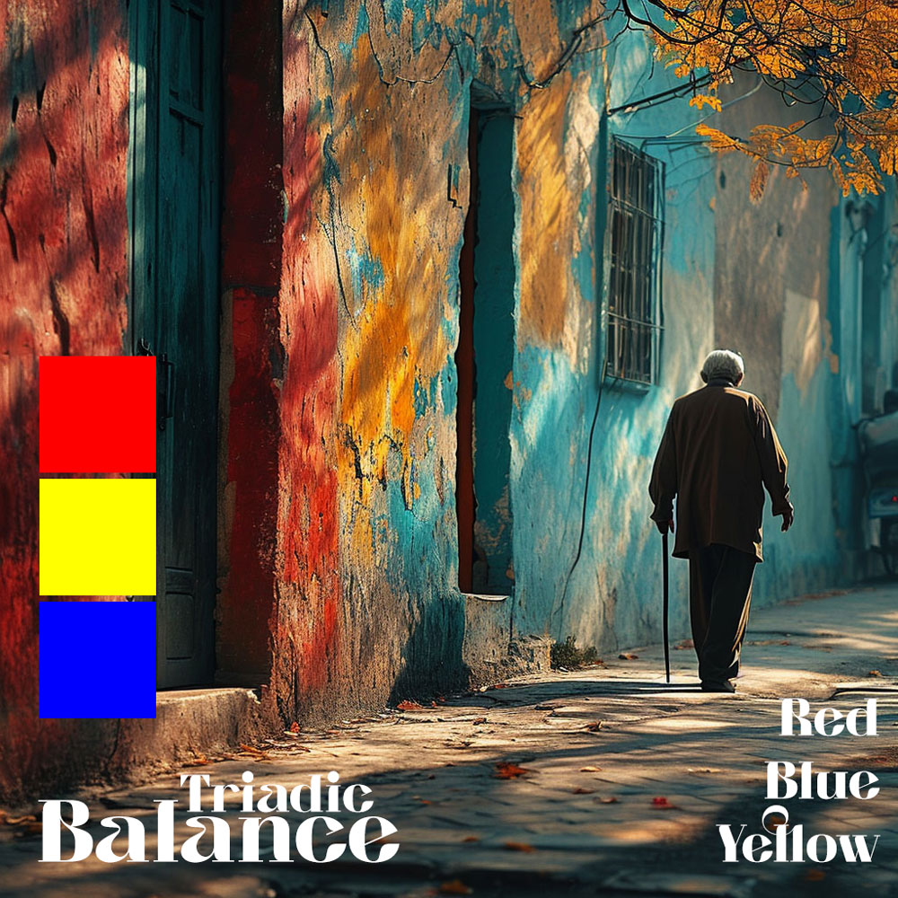
The image creates a sense of balance and visual harmony by utilizing a triadic color scheme, consisting of the primary colors red, blue, and yellow. These colors are spaced evenly around the color wheel, providing a vibrant yet balanced composition. The red and blue on the walls add a bold and energetic contrast, while the yellow leaves and the warm sunlight bring in a sense of brightness and life.
This triadic harmony engages the viewer, with each color supporting the others, neither overwhelming nor receding too much into the background, thus achieving a dynamic equilibrium in the scene. The presence of the elderly person, walking away, adds a narrative element, evoking feelings of passage and the continuity of life against the timeless vibrancy of primary colors.Tension:
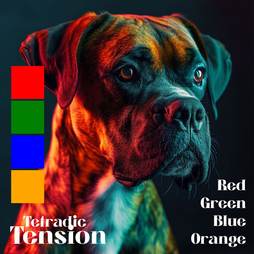
In this image, the tetradic color scheme involving red, green, blue, and orange creates a vibrant and dynamic tension that captivates the viewer. The red and orange hues on one side of the dog’s face, against the contrasting green and blue tones on the other, produce an asymmetrical balance that is both striking and visually intriguing. This use of contrasting colors from opposite ends of the color wheel injects energy and a sense of vivacity into the composition, highlighting the dog’s features in an unconventional manner.
The interplay of warm and cool colors also gives the image a three-dimensional quality, enhancing the dog’s form against the dark background. The result is a visually stimulating image that draws the viewer’s eye across the composition, creating a narrative of balance amidst discordance.Emphasis:
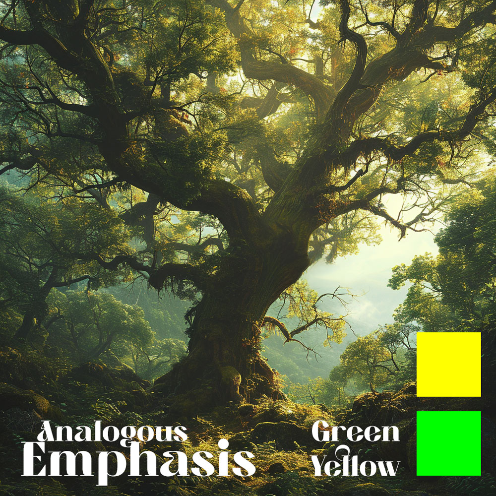
The use of analogous colors in this serene image of an old tree in a lush forest creates a cohesive and tranquil scene. The greens of the leaves and moss, the yellows of the sunlight filtering through, and the darker greens verging into browns of the tree’s bark and the forest floor form a spectrum of adjacent colors on the color wheel.
This creates a natural gradient effect that is pleasing to the eye, emphasizing the grandeur and vitality of the tree. The gentle progression from one color to the next draws the viewer into the scene, emphasizing depth and fostering a sense of harmony with nature. The overall effect is one of peacefulness and an organic flow, where each color supports and enhances the others without any one dominating or disrupting the visual balance.
Color Context
Color context is the influence of the surrounding colors on the perception and interpretation of a color. It can affect the hue, saturation, and value of a color, as well as its emotional and symbolic meaning.
Color context can create different effects and meanings in our photos, such as:
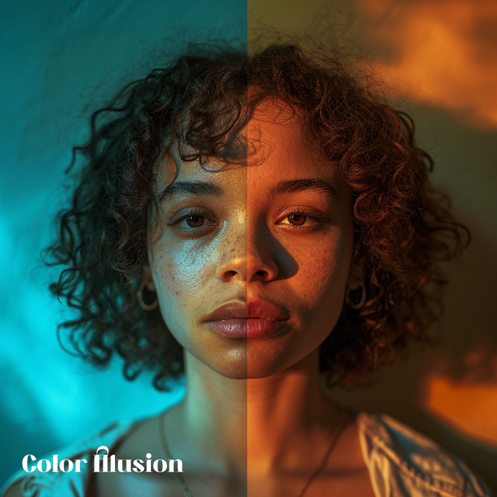
Illusion:
A change in the appearance of a color that is caused by the contrast or comparison with another color. Color Illusions are images where surrounding colors trick the human eye into incorrect interpretation of color. For example, a color can appear lighter or darker, warmer or cooler, brighter or duller, depending on the background or adjacent color.
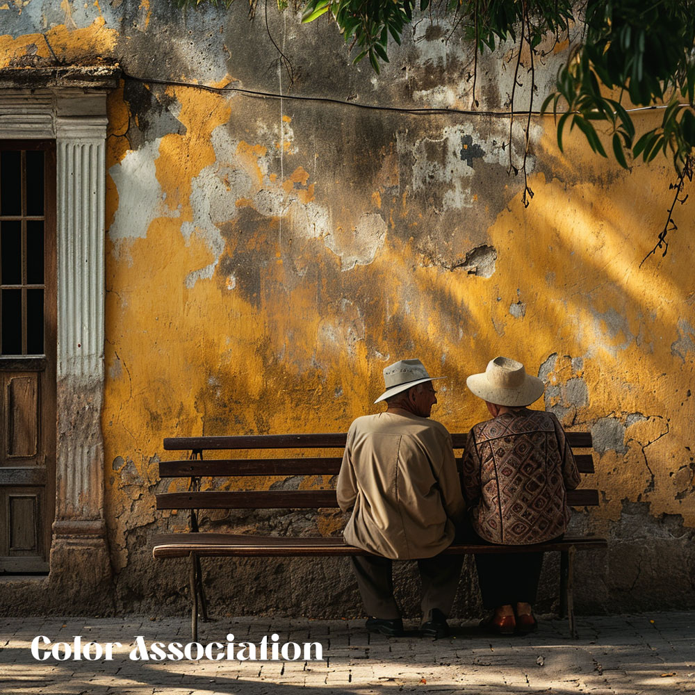
Association:
A connection or relation of a color with a concept, idea, or emotion that is influenced by the culture, history, or personal experience of the viewer. For example, a color can evoke different associations, such as red for love, anger, or danger, depending on the context and the viewer.
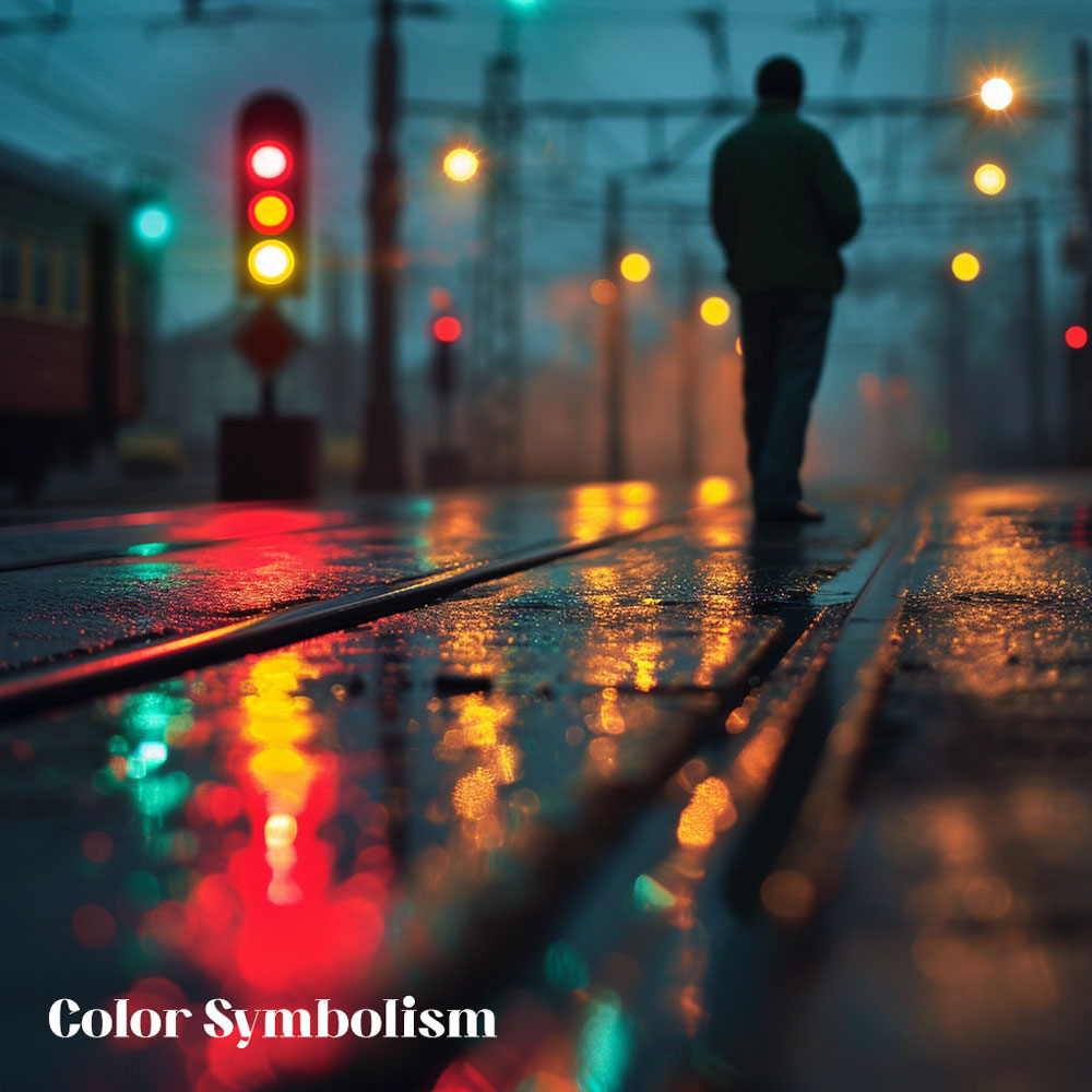
Symbolism:
A representation or expression of a color with a meaning, message, or theme that is intended by the creator or the viewer. For example, a color can symbolize different things, such as blue for sky, water, or peace, depending on the context and the intention.
Color context can help us create photos that are realistic or abstract, and that appeal to the viewer’s senses and emotions.
Colors are not just visual elements in photography. They are also powerful tools that can evoke specific emotions in viewers. Colors can create mood, atmosphere, and feeling in a photograph, and they can also communicate a message, a theme, or a story.
In this section, we will cover the following topics:
How colors can evoke different emotions
How to use color schemes to set the mood of a photograph
How to use color psychology to enhance your storytelling skills
How Colors Can Evoke Different Emotions
Colors can affect the way we feel, think, and behave. This is because colors have psychological associations that are influenced by our culture, history, and personal experience. Colors can trigger memories, emotions, and sensations in our minds and bodies.
For example, red can evoke feelings of love, passion, excitement, or anger. Blue can evoke feelings of calmness, peace, sadness, or coldness. Yellow can evoke feelings of happiness, optimism, energy, or anxiety. Green can evoke feelings of nature, growth, health, or envy.
Of course, these are not the only emotions that colors can evoke, and they are not the same for everyone. Different people may have different reactions to the same color, depending on their context, mood, and personality. However, there are some general trends and patterns that can help us understand how colors can affect our emotions.
Here is a table that shows some common emotional effects of colors, based on research and studies:
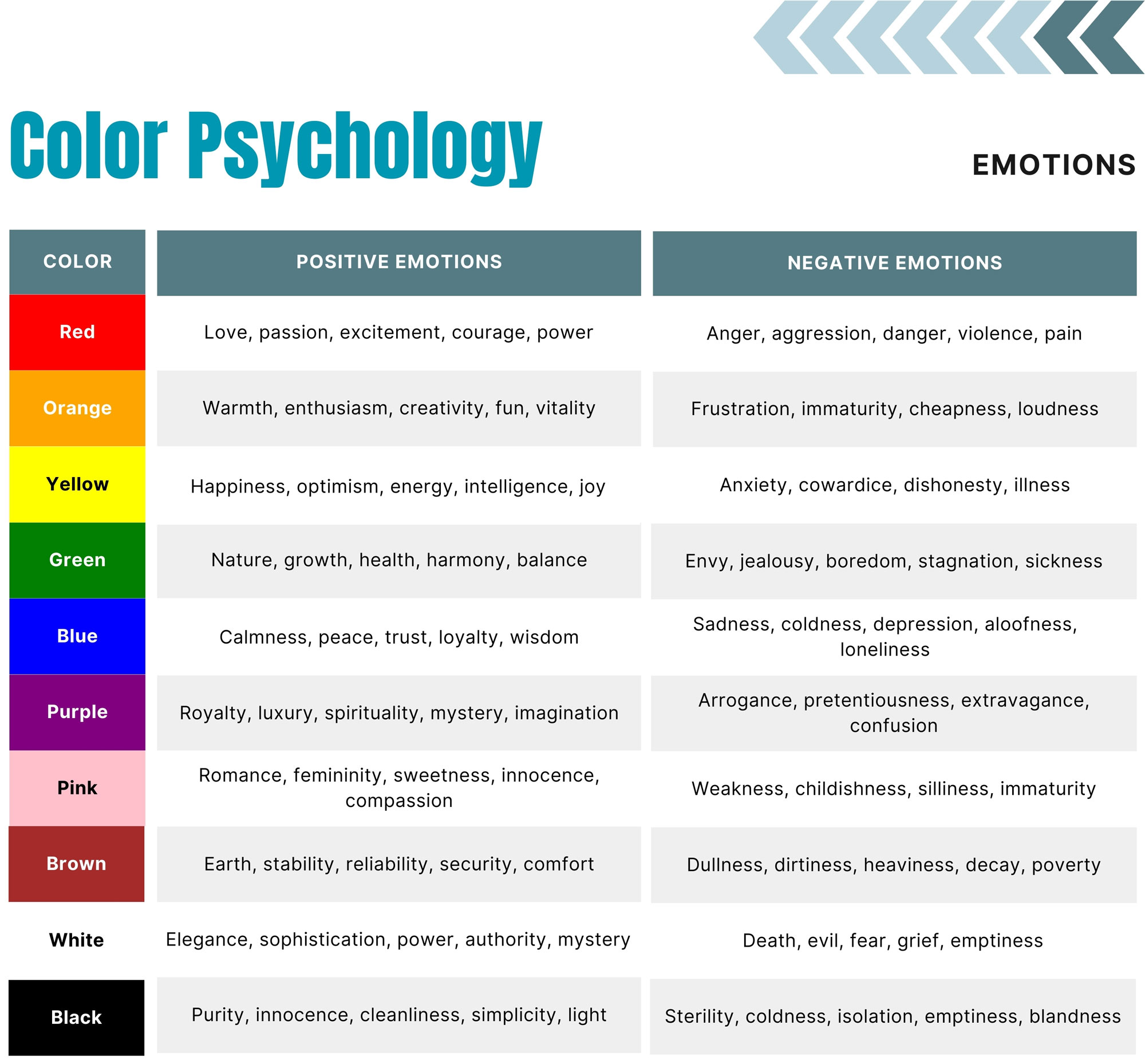
As you can see, colors can have both positive and negative emotions associated with them, depending on how they are used and perceived. Colors can also have different meanings in different cultures and contexts, so it is important to be aware of the possible interpretations and implications of your color choices.
One of the ways to use colors effectively for storytelling is to use color schemes to set the mood of a photograph. Color schemes are combinations of colors that create a certain effect or atmosphere in a composition. They can help you convey a message, a theme, or a story with your photos.
As we learned in the previous section, color schemes can be based on the color wheel, such as monochromatic, analogous, complementary, triadic, or tetradic. However, color schemes can also be based on other factors, such as temperature, brightness, or contrast.
Here are some examples of how to use color schemes to set the mood of a photograph:
Temperature:
Temperature refers to how warm or cool a color is, based on its association with fire or ice respectively. Warm colors, such as red, orange, and yellow, can create a mood of warmth, coziness, happiness, or excitement. Cool colors, such as blue, green, and purple, can create a mood of coolness, calmness, sadness, or relaxation. You can use warm or cool colors to create contrast or harmony in your photos, depending on the mood you want to create.
Brightness:
Brightness refers to how light or dark a color is, based on its value or luminosity. Bright colors, such as white, yellow, and pink, can create a mood of lightness, optimism, energy, or joy. Dark colors, such as black, brown, and gray, can create a mood of darkness, pessimism, calmness, or grief. You can use bright or dark colors to create contrast or harmony in your photos, depending on the mood you want to create.
Contrast:
Contrast refers to how different or similar two colors are, based on their hue, saturation, or value. High contrast colors, such as complementary colors, can create a mood of drama, tension, excitement, or impact. Low contrast colors, such as analogous colors, can create a mood of subtlety, harmony, balance, or softness. You can use high or low contrast colors to create contrast or harmony in your photos, depending on the mood you want to create.
Warm vs Cool Colors
Warm and cool colors are two categories of colors that are based on their association with fire or ice respectively. Warm colors are the colors that range from red to yellow on the color wheel, such as orange, pink, and brown. Cool colors are the colors that range from green to violet on the color wheel, such as blue, purple, and gray.
Warm and cool colors have different effects on human emotions, because they have different psychological associations that are influenced by our experience and perception of nature. Warm colors are associated with warmth, coziness, happiness, excitement, or passion. Cool colors are associated with coolness, calmness, sadness, relaxation, or peace.
Here are some examples of warm and cool tones that can be found in nature:n
Warm tones: Sun, fire, autumn leaves, flowers, fruits, etc.
Cool tones: Sky, water, snow, ice, mountains, etc.


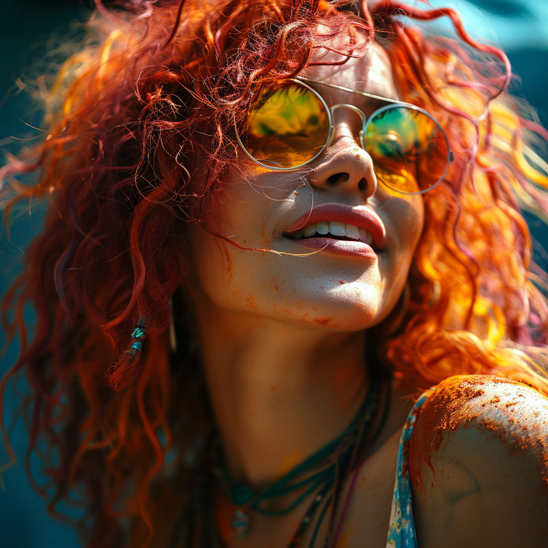
The series of images illustrates the evocative power of warm and cool colors in shaping the emotional tone of a portrait.
In the first, the subject is cast in cool blue tones that convey a sense of calm and introspection. The cool lighting hints at stillness and concentration, perhaps suggesting a moment of rest or the calm before a storm, often associated with the tranquility and peace of cooler colors.
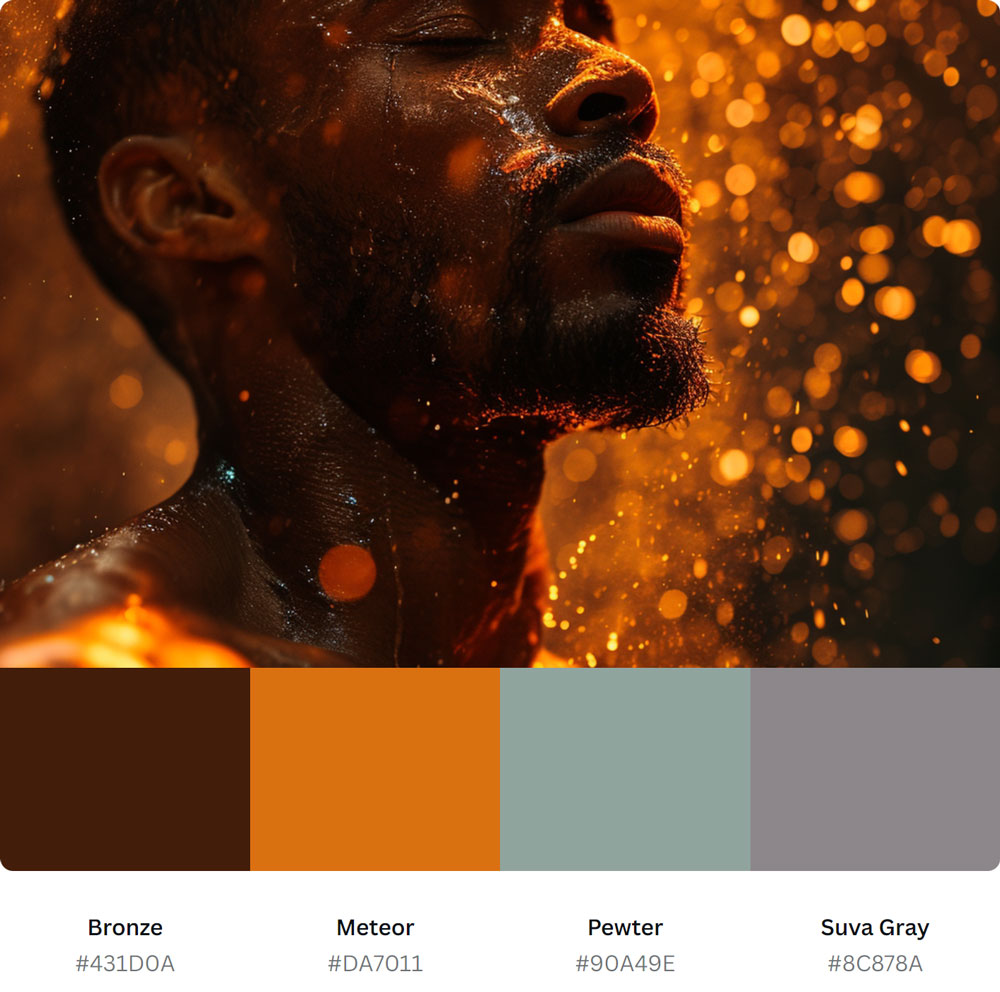
The second image, bathed in warm golden hues, paints a starkly different mood. It captures the essence of energy and passion. The warm colors reflect an active spirit and the intensity of life, suggesting movement and the heat of action, embodying the warmth and vibrancy associated with such tones.
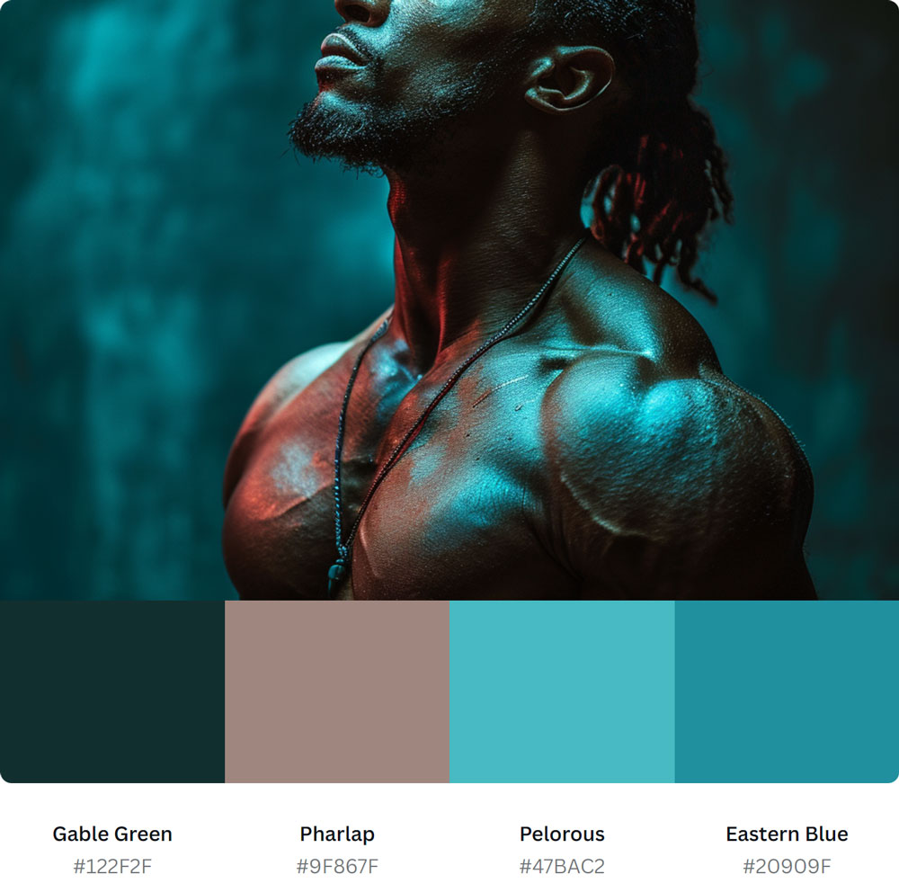
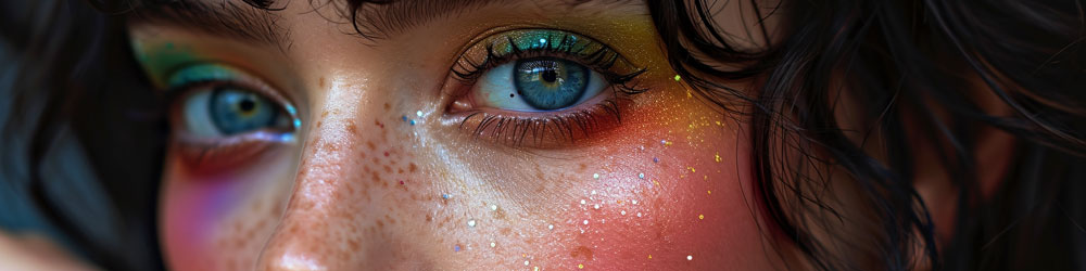
The third image interweaves the cool and warm spectrums, creating a portrait of complexity and depth. The cool blues give the skin a radiant, almost otherworldly appearance, while the warm glows suggest a liveliness bubbling beneath the surface. The contrast of the two temperature spectrums amplifies the emotional charge of the image, where droplets on the subject’s skin catch and reflect the varied lights, emphasizing a state of dynamic balance.
Together, these images showcase how warm and cool colors can be used to depict a range of emotions, from thoughtful serenity to fiery intensity, and how their interplay can suggest a nuanced, multifaceted human experience.
Here are some tips on how to use warm and cool tones effectively to convey different emotions in your photographs:
Use warm tones to create a warm mood,
such as happiness, excitement, or passion. For example, you can use a warm tone, such as red, to create a warm mood in a photograph of a sunset or a couple.
Use cool tones to create a cool mood,
such as sadness, relaxation, or peace. For example, you can use a cool tone, such as blue, to create a cool mood in a photograph of a lake or a landscape.
Use a combination of warm and cool tones
to create contrast or harmony in your photographs, depending on the effect you want to create. For example, you can use a combination of warm and cool tones, such as orange and blue, to create contrast in a photograph of a city or a beach. You can also use a combination of warm and cool tones, such as yellow and green, to create harmony in a photograph of a field or a forest.
Warm and cool colors are the two basic categories of colors that can help you create different moods and emotions in your photographs.
Bright vs Dark Colors
Bright and dark colors are two categories of colors that are based on their association with light or shadow respectively. Bright colors are the colors that have a high value or luminosity, such as white, yellow, and pink. Dark colors are the colors that have a low value or luminosity, such as black, brown, and gray.
right and dark colors have different effects on human emotions, because they have different psychological associations that are influenced by our experience and perception of nature. Bright colors are associated with light, optimism, energy, or joy. Dark colors are associated with shadow, pessimism, calmness, or grief.
Here are some examples of bright and dark tones that can be found in nature:
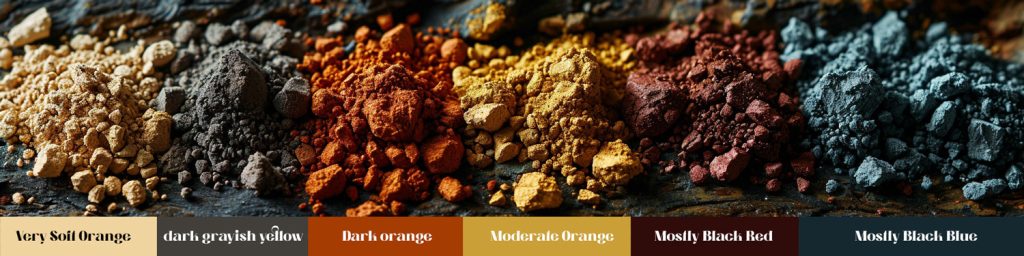
Bright tones: Snow, sun, flowers, fruits, etc.
Dark tones: Night, soil, rocks, wood, etc.
Here are some tips on how to use bright and dark tones effectively to create contrast or harmony in your photographs:
Use bright tones to create a bright mood,
such as optimism, energy, or joy. For example, you can use a bright tone, such as yellow, to create a bright mood in a photograph of a sunflower or a lemon.
Use dark tones to create a dark mood,
such as pessimism, calmness, or grief. For example, you can use a dark tone, such as black, to create a dark mood in a photograph of a night sky or a crow.
Use a combination of bright and dark tones
to create contrast or harmony in your photographs, depending on the effect you want to create. For example, you can use a combination of bright and dark tones, such as white and black, to create contrast in a photograph of a zebra or a chessboard. You can also use a combination of bright and dark tones, such as yellow and purple, to create harmony in a photograph of a field or a butterfly.
Bright and dark colors are the two basic categories of colors that can help you create different moods and emotions in your photographs.
Natural vs Artificial Colors
Natural and artificial colors are two categories of colors that are based on their origin from nature or human-made sources respectively. Natural colors are the colors that are derived from natural elements, such as plants, animals, minerals, or water. Artificial colors are the colors that are created by human intervention, such as chemicals, dyes, paints, or lights.
Natural and artificial colors have different effects on human emotions, because they have different psychological associations that are influenced by our experience and perception of nature. Natural colors are associated with authenticity, familiarity, nature, or health. Artificial colors are associated with illusion, novelty, culture, or technology.

Here are some examples of natural and artificial colors that can be found in nature:
Natural colors: Green, brown, blue, red, orange, yellow, etc.
Artificial colors: Pink, purple, gray, black, white, neon, etc.
Here are some tips on how to use natural and artificial colors effectively to create realism or fantasy in your photographs:
Use natural colors To create a realistic mood, such as authenticity, familiarity, nature, or health.
For example, you can use natural colors, such as green and brown, to create a realistic mood in a photograph.
Use artificial colors to create a fantasy mood, such as illusion, novelty, culture, or technology.
For example, you can use artificial colors, such as pink and purple, to create a fantasy mood in a photograph of a unicorn or a fairy. Keep in mind, you’re not limited to fantasy, when using artificial colors.
Use a combination of natural and artificial colors to create contrast or harmony in your photographs
Depending on the effect you want to create, for example, you can use a combination of natural and artificial colors, such as blue and neon, to create contrast in a photograph of a city or a nightclub. You can also use a combination of natural and artificial colors, such as red and pink, to create harmony in a photograph of a flower or a heart.

The three images present a compelling use of color, each leveraging the unique qualities of natural and artificial colors to set a distinct mood and atmosphere.
In the first image,
the fusion of natural and artificial colors creates a striking and vibrant portrait. The teal and azure pigments splashed across the subject’s face are evocative of natural elements like water and sky, while their metallic sheen introduces an artificial quality that feels both modern and fantastical. This blend crafts a narrative that bridges the organic and the imaginative, imbuing the portrait with a sense of wonder and creativity.
The second photograph,
steeped in the golden hues of a setting sun, harnesses the power of natural colors to evoke warmth and nostalgia. The rich amber tones cast by the sunlight envelop the elderly subject, highlighting the textures of the environment and his contemplative expression. This use of natural light and color cultivates a feeling of depth and emotional resonance, connecting the viewer to the simple yet profound moments of everyday life.
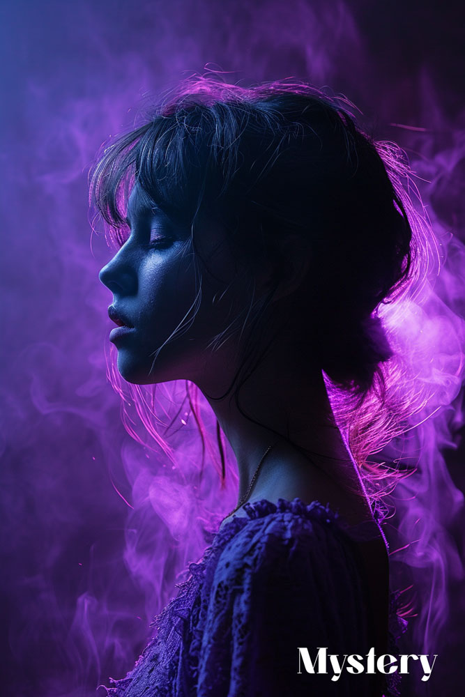
The third image
is a cascade of artificial colors, using theatrical lighting to create a dynamic and expressive portrait. The saturated pinks and blues cast an otherworldly glow on the subject, transforming the scene into one of drama and intensity. These artificial colors are often associated with the energy and pulse of contemporary life, offering a bold statement on identity and self-expression in the modern age.
Together, these images showcase the versatility of color in photography. The natural colors ground us in the familiar and the real, evoking emotions tied to the earth and our experiences within it.
In contrast, artificial colors invite us to explore the realms of the imagination, to feel the rush of heightened reality and the allure of the spectacle. Whether blended or standing alone, these colors shape our perception of the images and the stories they tell.
Natural and artificial colors are the two basic categories of colors that can help you create different moods and emotions in your photographs.
Another way to use colors effectively for storytelling is to use color psychology to enhance your storytelling skills. Color psychology is the study of how colors affect human behavior and cognition. It can help you understand how colors can influence the emotions, thoughts, and actions of your viewers.
Color psychology can help you enhance your storytelling skills in the following ways:
Attract attention:
Colors can help you attract the attention of your viewers by using colors that stand out, contrast, or complement each other. For example, you can use red to catch the eye, blue to create trust, or yellow to create curiosity.
Create emotion:
Colors can help you create emotion in your viewers by using colors that evoke specific feelings, associations, or memories. For example, you can use green to create a sense of nature, purple to create a sense of mystery, or pink to create a sense of romance.
Communicate meaning:
Colors can help you communicate meaning in your viewers by using colors that symbolize or represent a concept, idea, or theme. For example, you can use black to symbolize death, white to symbolize purity, or orange to symbolize creativity.
Colors are not only visual elements in photography. They are also compositional tools that can help you achieve the right balance and contrast in your photographs. Balance and contrast are two important principles of design that can enhance the storytelling aspect of your photographs.
In this section, we will cover the following topics:
What is balance and how to achieve it using colors
What is contrast and how to achieve it using colors
How to use balance and contrast to enhance your storytelling skills
How to Use Balance and Contrast to Enhance Your Storytelling Skills
One of the ways to use colors effectively for storytelling is to use balance and contrast to enhance your storytelling skills. Balance and contrast can help you create photographs that have a clear focal point, a strong composition, and a compelling message.
Balance and contrast can help you enhance your storytelling skills in the following ways:
Focal point:
A focal point is the element that draws the attention of the viewer in a photograph. It can be a subject, an object, or a detail that stands out from the rest of the composition. You can use colors to create a focal point by using colors that are different or contrasting from the background or the surrounding elements.
For example, you can use a bright color, such as yellow, to create a focal point in a photograph of a dark street.Composition:
A composition is the arrangement of the elements in a photograph. It can be influenced by factors such as the rule of thirds, the golden ratio, or the leading lines. You can use colors to create a composition by using colors that are symmetrical or asymmetrical in the photograph.
For example, you can use a symmetrical color scheme, such as monochromatic, to create a balanced composition in a photograph of a building. You can use an asymmetrical color scheme, such as complementary, to create a dynamic composition in a photograph of a person.Message:
A message is the meaning or theme that you want to convey with your photograph. It can be influenced by factors such as the subject, the mood, or the context. You can use colors to create a message by using colors that evoke specific emotions, associations, or symbolism in the viewer.
For example, you can use a warm color scheme, such as red, to create a message of love, passion, or excitement in a photograph of a couple. You can use a cool color scheme, such as blue, to create a message of calmness, peace, or sadness in a photograph of a landscape.
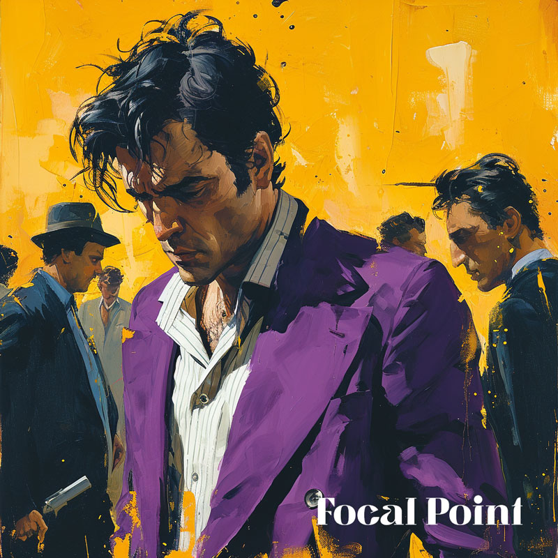
Focal Point Example:
This vivid artwork employs a striking focal point through the use of color contrast and composition. The central figure is dressed in a rich purple suit that immediately draws the eye, standing out against the vibrant yellow background. This choice of a complementary color scheme
—purple against yellow—creates a visual pop that ensures the figure dominates the scene. His downward gaze and the intense shadows on his face add a narrative weight, making him the clear subject of the piece. The surrounding figures, rendered in more muted tones, recede into the background, further emphasizing the central figure’s prominence.
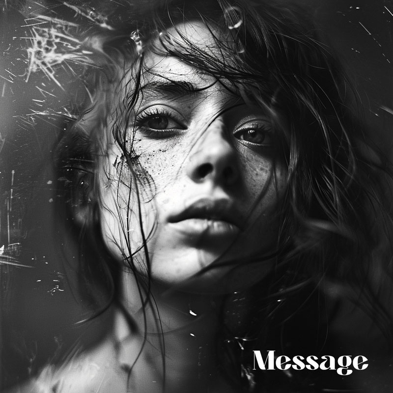
The splatters of paint around him, echoing the primary colors of his attire and the background, enhance the focal point, giving the impression that the action and emotion of the scene radiate from him.Message Example:
This powerful monochromatic image conveys its message through the stark contrast of light and shadow, the intensity of the subject’s gaze, and the textural elements that frame her face. The absence of color focuses the viewer’s attention on the emotional gravity of the portrait. The play of light on the subject’s eyes and the subtle highlights on her facial features suggest a narrative of introspection and vulnerability.
The dark tones and shadows enveloping her form could symbolize isolation or the weight of personal struggles. The use of a high-contrast black and white palette strips away any distractions, allowing the subject’s expression and the photograph’s mood to speak directly to the viewer, potentially evoking feelings of empathy, contemplation, or even an echo of their own inner experiences.
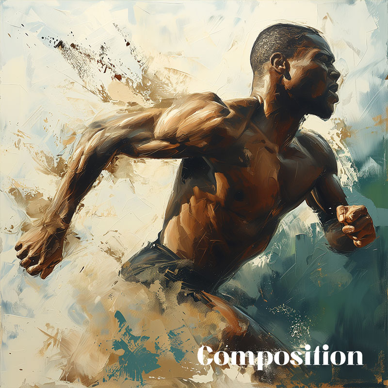
The message here is one that resonates on an emotional level, speaking of the human condition and the profundities within.Composition Example:
The painting utilizes an asymmetrical color composition to convey the dynamic movement of an athlete in stride, contrasting warm, earthy tones of the figure with cool, subdued background shades. Warm hues accentuate the subject’s muscular form and suggest forward motion, while the cooler background colors provide a calm backdrop, making the athlete’s form stand out with a sense of depth and vitality.
Strategic splashes of lighter tones intersect the figure, enhancing the composition’s overall sense of energy and movement, drawing the viewer’s eye through the painting and emphasizing the narrative of athletic prowess.
By using balance and contrast, you can create photographs that are not only visually appealing, but also emotionally engaging and meaningful. You can use colors to tell a story with your photographs, and to connect with your viewers on a deeper level.
What is Balance and How to Achieve It Using Colors
Balance is the sense of order and stability that is created by the distribution of visual weight in a photograph. Visual weight is the perceived importance or attraction of an element in a composition. It can be influenced by factors such as size, shape, color, texture, or position.
Balance can be achieved by using colors that are symmetrical or asymmetrical in a photograph.
Symmetrical balance is when the elements are arranged equally on both sides of a central point or axis. Asymmetrical balance is when the elements are arranged unequally on both sides of a central point or axis, but still create a sense of equilibrium.
Symmetrical vs Asymmetrical Balance
Symmetrical and asymmetrical balance have different effects on human emotions, because they create different impressions and feelings in the viewer. Symmetrical balance is associated with stability, order, formality, or calmness. Asymmetrical balance is associated with movement, dynamism, informality, or excitement.
Here are some examples of how to use colors to achieve balance in your photographs:
Symmetrical balance:
You can use colors that are similar or identical on both sides of the photograph, such as monochromatic or analogous colors. For example, you can use a monochromatic color scheme of blue to create a symmetrical balance in a photograph of the sky and the sea.
Asymmetrical balance:
You can use colors that are different or contrasting on both sides of the photograph, such as complementary or tetradic colors. For example, you can use a complementary color scheme of red and green to create an asymmetrical balance in a photograph of a flower and a leaf.
This image represents asymmetrical color balance using an analogous scheme of green and yellow. The composition achieves balance not through mirror symmetry but through the thoughtful placement and contrast of various elements within the color palette.
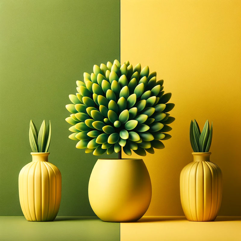
This is a visual example of symmetrical color balance with an analogous color scheme of green and yellow. The composition is centered and balanced, with the colors complementing each other to create a balanced and pleasing arrangement.
Balance can help you create photographs that are pleasing to the eye, and that communicate a sense of order and stability.
Contrast is the difference or variation between two or more elements in a photograph. It can create a sense of drama, tension, excitement, or impact. Contrast can be achieved by using colors that are high or low in contrast in a photograph. High contrast colors are colors that are very different or opposite in hue, saturation, or value. Low contrast colors are colors that are very similar or close in hue, saturation, or value.

High vs Low Contrast
Here are some examples of how to use colors to achieve contrast in your photographs:
High contrast:
You can use colors that are opposite or contrasting on the color wheel, such as complementary, triadic, or tetradic colors. For example, you can use a triadic color scheme of red, blue, and yellow to create a high contrast in a photograph of a carnival.
Low contrast:
You can use colors that are next to or close on the color wheel, such as analogous, monochromatic, or split-complementary colors. For example, you can use a split-complementary color scheme of green, orange, and purple to create a low contrast in a photograph of a forest.
Below are examples of contrast in values:

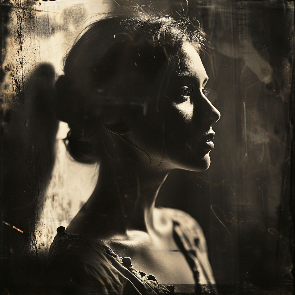
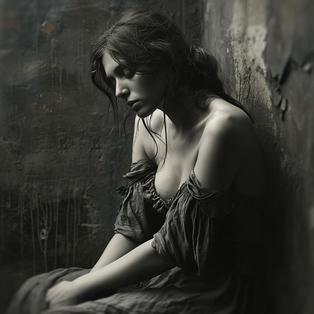
The two monochromatic images above provided each utilize contrast differently to achieve a unique visual impact in black and white.
The first image exhibits high contrast, where the stark differences between the deep blacks and the bright whites create a dramatic effect.
The intensity of the shadows and the brightness of the light areas draw attention to the subject’s profile, adding a sense of depth and dimension to the composition.
This high contrast enhances the facial features and expressions, leading to a powerful and emotionally charged portrayal.The second image employs low contrast, using a more subtle range of mid-tones that bridge the blacks and whites.
This creates a softer, more nuanced image where details emerge gently, and the mood is more reflective than intense.
The lower contrast results in a quieter, more harmonious visual, evoking a sense of calmness or melancholy without the sharp delineations of the higher contrast image.
In black and white photography, contrast and value is key to directing the viewer’s attention and setting the emotional tone of the image. High contrast often conveys a sense of action or tension, while low contrast can suggest tranquility or pensiveness. Both techniques are effective in different contexts, depending on the message the photographer wishes to convey.
Here are some examples of high vs low contrast that can be found in nature using colors:
High contrast: Sun and moon, fire and water, snow and desert, etc.
Low contrast: Sky and sea, grass and leaves, sand and rocks, etc.

Here are some tips on how to use high vs low contrast effectively to create impact or mood in your photographs:
Use high contrast to create a dramatic mood,
such as drama, tension, excitement, or impact. For example, you can use a high contrast color scheme, such as black and white, to create a dramatic mood in a photograph of a storm or a silhouette.
Use low contrast to create a subtle mood,
such as subtlety, harmony, balance, or softness. For example, you can use a low contrast color scheme, such as gray and beige, to create a subtle mood in a photograph of a foggy or a vintage scene.
High and low contrast are two types of contrast that can help you create different effects and meanings in your photographs.
Now that you have learned the basics of color theory, the emotional impact of colors, and how to master color balance and contrast, you might be wondering how to apply this knowledge to your own photography projects. In this section, I will offer some practical tips and advice for implementing color theory in your photography.
Here are some tips for implementing color theory in your photography:
Experiment with different color schemes:
One of the best ways to learn and practice color theory is to experiment with different color schemes and see how they affect your photos. You can use the color wheel as a guide, or you can use your own intuition and creativity.
Try to use different types of color schemes, such as monochromatic, analogous, complementary, triadic, or tetradic, and see how they create different effects and meanings in your photos. You can also try to mix and match different color schemes, or use more than one color scheme in a single photo, to create more complex and interesting results.Find inspiration from different sources:
Another way to learn and practice color theory is to find inspiration from different sources, such as nature, art, culture, or emotions. You can look for colors that suit your style and vision, and that match your subject matter, mood, message, or theme.
You can also look for colors that challenge or surprise you, and that make you think or feel something new. You can use these sources of inspiration to create your own color palette or mood board, and use them as a reference for your photography projects.Use tools and resources to learn more and improve your skills:
A third way to learn and practice color theory is to use tools and resources that can help you learn more and improve your skills. There are many tools and resources available online or offline, such as books, websites, apps, courses, etc., that can teach you more about color theory and help you experiment with different color combinations.
You can use these tools and resources to improve your color knowledge and creativity, and to get feedback and suggestions for your photography projects.
By following these tips, you can implement color theory in your photography effectively and confidently. You can use color theory to create stunning and meaningful photographs that will move the world.
Learning color theory can be fun and rewarding, but it can also be challenging and overwhelming. Fortunately, there are many tools and resources that can help you learn more about color theory and practice your color skills. Whether you prefer reading books, browsing websites, using apps, or taking courses, there is something for everyone.
Here are some examples of some tools and resources that can help you learn color theory:
Books: Books are a great way to learn the basics and the history of color theory, as well as to get inspiration and guidance from experts and artists. Some of the best books on color theory are:
This book is a practical and comprehensive guide to color theory, with exercises and projects to help you apply what you learn.
This book is a classic and influential work on color theory, with illustrations and examples to show how colors interact and change in different contexts.
This book is a concise and clear introduction to color theory, with diagrams and explanations to show the color wheel, color harmony, and color effects.
Websites: Websites are a convenient and interactive way to learn and practice color theory, as well as to explore and generate different color schemes and palettes. Some of the best websites on color theory are:
This website is a powerful and versatile tool to create and edit color schemes, based on different color rules and modes. You can also browse and download thousands of color schemes created by other users.
This website is a rich and informative resource on color theory, color psychology, color symbolism, and color design. You can also find quizzes, games, and articles to test and expand your color knowledge.
This website is a useful site for anyone who works with colors in design, art, web development or photography. It can help you find the perfect color for your project or learn more about the properties and meanings of different colors.
This website is a simple and fun way to learn the basics of color theory, with an interactive color wheel that shows you different color combinations and their effects. You can also use the website to create your own color palettes and apply them to various design templates with the tools below at Canva.nn1. [Color Palette Generator] 2. [Color Palette Ideas] 3. [Color Wheel] 4.[Color Meanings]
Here are some tips on how to use these tools and resources to improve your color knowledge and creativity:n
Use a variety of tools and resources
to learn and practice color theory, as each one has its own strengths and features. For example, you can use books to learn the theory, websites to practice the skills, and apps to create the palettes.
Experiment with different colors and color schemes,
and see how they affect your mood, message, and style. For example, you can use warm or cool colors, bright or dark colors, natural or artificial colors, etc.
Get feedback and inspiration from others,
and share your own work and ideas. For example, you can join online communities, forums, or groups that are related to color theory, and exchange tips, suggestions, and opinions.
By using these tools and resources, you can learn color theory effectively and confidently, and create stunning and meaningful photographs that will move the world.
Color theory is a fascinating and useful topic that can help you create stunning and meaningful photographs. By understanding the basics of color theory, such as primary, secondary, and tertiary colors, color wheel, color harmony, and color context, you can choose the right colors for your photos, and use them effectively to convey your message.
By understanding the emotional impact of colors, such as how colors can evoke different emotions, how to use color schemes to set the mood of a photograph, and how to use color psychology to enhance your storytelling skills, you can create photos that are not only visually appealing, but also emotionally engaging and meaningful. By mastering color balance and contrast, such as what is balance and how to achieve it using colors, what is contrast and how to achieve it using colors, and how to use balance and contrast to enhance your storytelling skills, you can create photos that have a clear focal point, a strong composition, and a compelling message.
By following the practical tips for implementing color theory in your photography, such as experimenting with different color schemes, finding inspiration from different sources, and using tools and resources to learn more and improve your skills, you can implement color theory in your photography effectively and confidently. I hope you enjoyed this blog post on color theory in storytelling photography, and learned something new and useful. I hope you will apply what you learned to your own photography projects, and create images that will move the world.
Thank you for reading, and happy shooting!

Visual Storytelling Techniques: A Guide to Creating Powerful Stories with Images and Words What You Will Learn Overview: Table of Content How to Craft Compelling Stories with Visual Elements What is Visual Storytelling and Why is it Important? Visual storytelling is the art of using images and words to create a powerful story that connects…


Leave a Reply